Dahlia Soap Co
Dahlia Soap Co, a luxurious artisan soap company based in Vancouver, specializes in handcrafting exclusive bars sourced from natural ingredients in sustainable ways. They believe self-love begins with hygiene, offering a sensory-rich experience that nurtures both body and soul.
Drawing inspiration from historical artisans, Dahlia takes great pride in meticulously crafting each soap bar as a unique masterpiece. Their soaps captivate with fragrant essential oils and nourishing butter, creating an escape into serenity. Dahlia Soap Co isn't just skincare—it's pure bliss.
Project Type
Branding & Identity
Logo Design
Package Design
UI Design
Year
2024

Brand Concept
Dahlia Soap Co. is defined by its dedication to artistry, quality, and a rich cultural heritage. By infusing elements from Nordic culture such as intricate patterns, earthy hues, and depictions of flora, I made each design reflect the company’s deep-rooted connection to these traditions.
Colour Palette
The primary colours was black with seaweed and beige as the accent colours. The palette was kept muted and dark to emphasize the brand’s sense of luxury.
White
#FFFFFF
Seaweed
#595444
Beige
#E8E6E3
Black
#080A06
Soap Packaging
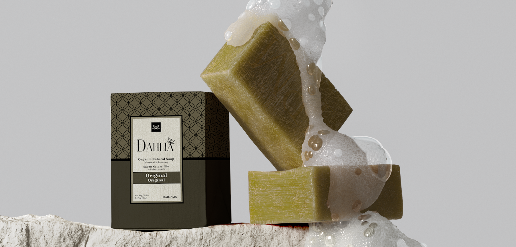
There are three designs: The Original, Black Diamond and Rose Quartz. The designs follows a clean, modern style. The geometric solid shapes was paired with a pattern to create balance.
Website
The Challenge
The project posed a dual challenge: to convey a luxurious yet welcoming, nature-friendly aesthetic. It was also important to maintain a modern minimalist brand identity while preserving its historical and traditional values. Balancing these objectives ensured the brand remained relevant and appealing across diverse audiences while staying true to its heritage.
Promotional Page
Logo Design
The design is inspired by the shape of dahlia petals, presenting a face-on view of the flower. The dot above the flower symbolizes the sun, reflecting the brand’s connection to nature.
Additionally, the design evokes the image of a butterfly, drawing on Nordic folklore where butterflies were called Freyja Hen’s after Freyja, the goddess of beauty. This connection to beauty aligns with the brand’s focus on self-love and its place in the beauty industry.


